Quantcast
Channel: Bootstrap Blog
Viewing all 134 articles
Browse latest View live

Bootstrap 5 Beta 2

$
0
0

Our second beta has arrived for Bootstrap 5! We delayed its release to iron out some issues with third-party libraries and stabilize our major changes. We’ve also once again shipped some awesome updates to our documentation.

Next up is our final beta, which we may even promote to a stable release depending on how development proceeds. Stay tuned for that!

Dropdown docs screenshot

Dropdowns saw a lot of work in Beta 2 because of how much has changed in both our JavaScript and in Popper.js (which we depend on for most dropdown, popover, and toolip positioning). We’ve modified our dropdown plugin to add a new data attribute to help separate our own positioning styles with that of Popper’s. The issues we saw—like a .dropstart menu overlapping a button or an incorrect responsive .dropdown-menu-end class—were largely the result of competing positioning.

Now when dropdown menus have data-bs-display="static", we’ll add data-bs-popper="static" via JavaScript to their associated .dropdown-menu. When dropdowns are in our navbars, their menus will have data-bs-popper="none" added. This separates two different positioning libraries, ours and Poppers, and ensures all behaviors are supported. You can see all the options in a new example in our docs. We updated our CSS selectors to use these new data attributes, too.

In addition, we’ve removed the initial margins from dropdowns and popovers, instead of relying on Popper’s offsets. These also conflicted with the default styling for elements positioned by Popper.js. Relatedly, there was a bug in how popover arrows were aligned that has now been resolved.

Color utility docs

Sass docs screenshot

We’ve overhauled our color utility documentation, separating the text color classes from our background-color ones. We’ve also made extensive use of our scss-docs shortcode to include tons more code snippets in our docs.

Both pages now include a new Sass section, showing relevant snippets of our source code that are related to each set of utilities. We list all our available color variables, our theme color variables and maps, associated mixins and loops, and even where these utilities are generated in the utilities API.

Expect this kind of documentation improvements to continue into our next release. Follow along in the draft pull request that adds Sass docs to all our components on GitHub.

JS updates

We’ve spent a significant amount of time in Beta 2 improving our JavaScript plugins to fix bugs and improve behaviors since dropping jQuery.

  • Dropdown now emits events on the .dropdown-toggle instead of the .dropdown.
  • Restored the offset option for dropdowns.
  • Fixed modal toggling when clicking on data-bs-toggle="modal".
  • We now build our base component as a separate .js file.
  • We now prevent getSelector from returning URLs as selector which caused errors in dropdown and scrollspy plugins.
  • Refactored components to use a utility function to define jQuery plugins

Miscellaneous updates

Across the board, we’ve made a few small changes to other components that are worth a brief mention here.

  • Navbars:
    • Added a new .navbar-nav-scroll class to enable vertical scrolling when a collapsed navbar is opened. It’s customizable via Sass and a CSS variable. Read more in the docs.
    • We’ve re-added flex-grow to the .navbar-collapse to restore the flexbox behaviors from v4 and prevent some content from being inadvertently squished.
  • Forms:
    • Removed vertical-align from .form-select
    • Form validation mixin updated with additional parameters
    • Fixed validation icon placement in .form-select
    • Checkboxes and radio buttons are aligned better in input groups
  • Buttons:
    • Added variables for tinting and shading button state colors
    • Suppressed the default focus outline for buttons in Chromium
  • Toasts:
    • Added word-break to .toast-body
    • Added a live example to the docs to trigger a real toast
  • Bundles:
    • Added our helpers to the utilities CSS bundle
  • Carousels:
    • Updated docs examples to use <button>s wherever possible instead of <a> elements.
    • CSS selectors changed for using <button>s as indicators (from .carousel-indicators li to .carousel-indicators [data-bs-target]).

For a more complete list of changes, check out the v5 Beta 2 project board or list of issues and PRs in this release.

Get started

Head to https://getbootstrap.com to explore the new release. We’ve also published this updated as a pre-release to npm, so if you’re feeling bold or are curious about what’s new, you can pull the latest in that way.

npm i bootstrap@next

What’s next

We have three releases coming up next for the team:

  • Bootstrap v5.0.0-beta3 (possibly promoted to v5 stable)
  • Bootstrap v4.6.1 (bringing in some more bugfixes and alignment with the latest in v5)
  • Bootstrap Icons v1.4.0

Our v5 Beta 3 will continue to focus on JavaScript issues and documentation improvements. Tooltips in particular need some attention after our fixes to dropdowns and popovers. After v5 goes stable, we’ll look to adding some of the awesome features we’ve built up in our backlog. Check out the v5.1 project for an idea of what’s being planned.

Support the team

Visit our Open Collective page or our team members’ GitHub profiles to help support the maintainers contributing to Bootstrap.


Bootstrap Icons v1.4.0

$
0
0

Bootstrap Icons v1.4.0 adds over 60 new icons as part of a brand new weather category. Also included are some long requested improvements to vertical alignment and a handful of updates to tags and categories.

Keep reading for a preview of the new icons and how icon alignment has changed.

60+ weather icons

New icons in v1.4.0

The new weather category includes over 60 icons for various weather and atmospheric conditions. From fog and haze to rainstorms and hurricanes, we now have icons for just about every weather situation. We undoubtedly have some more work to do to refine and add to this new category, but it’s a pretty big addition to the project. Let us know what you think and what’s missing so we can keep adding to it over time.

Alignment changes

Alignment changes

Also new in v1.4.0 are some alignment changes—before and after are shown above. Previously we used vertical-align: text-top in our CSS to aligning individual icons. This wasn’t as much of an issue when we only had SVGs, but with the addition of icon fonts and their generated CSS in v1.2.0, we had to make some changes.

New in this release is a change to vertical-align: -.125em. This new alignment is similar to that found in the tried and true Font Awesome project. This change essentially raises icons up about 1px to better vertically center them with nearby text.

It may not be perfect in all implementations, so additional changes might still be needed, but this should give you a stronger baseline to start (pun intended). Should you still run into issues, please don’t hesitate to open an issue on GitHub.

And more…

We’ve also made several updates under the hood, from dependencies to build tools. This has resulted in improved speeds for our development scripts and more resilient tooling for packaging our icons. We’ve also included category names into the fuzzy search on the homepage, making it a lot easier to search for groups of icons.

We still have some work to do on our docs and search, so stay tuned as we’ll eventually add category pages and more for easier browsing and navigating. If you’re reading this and want to help improve the Bootstrap Icons docs, please consider opening a PR anytime.

Install

To get started, install via npm:

npm i bootstrap-icons

You can also download the release from GitHub, or download just the SVGs and fonts (without the rest of the repository files).

Figma

For the Figma users out there, you can also snag the icons from Figma.

Bootstrap 5 Beta 3

$
0
0

Our final beta for Bootstrap 5 has come with some amazing new changes (including a new component!), documentation updates, and more. We’ve also fixed some important bugs since our last release, in particular with our dependencies. Next up is our stable release!

Keep reading for a recap of what’s new in Beta 3.

New offcanvas component

Offcanvas example

Thanks to our newest team member, @GeoSot, we have a brand new component to unveil in Beta 3—introducing offcanvas! Built on and sharing fundamental pieces of our modals, the offcanvas comes with configurable backdrop, body scroll, and placement. Offcanvas components can be placed on the left, right, and bottom of the viewport. Configure these options with data attributes or via the JavaScript APIs.

We’re excited about iterating on the new offcanvas component and building additional examples and demos with you. Please share any feedback on an issue or pull request as you start to use it in your projects.

New and refreshed examples

New examples

Our examples have been updated in Beta 3 as well. We’ve added four brand new snippet-heavy examples and refreshed a few others. New with this release are several snippets for headers, heroes, features, and sidebars. These new snippets will continue to grow with new additions over time, showing just how fun and easy it is to build with Bootstrap.

New starter example

We’ve also updated our starter template with a refreshed, simplified design and more resource links. We’ll also incorporate this new look and feel into our npm starter project project, and eventually add a Parcel starter project.

Lastly, we’ve updated our pricing, checkout, and sign-in examples. We’ve also added a new jumbotron example to show you how to create your own jumbotron since we removed it in Bootstrap 5.

Improved Sass docs

New Sass docs

Since our last release, we’ve added a new section to nearly every component and utility documentation page for the source Sass code. Where appropriate, we now list Sass variables, maps, loops, and animation keyframes. These are directly linked from our source files, so whenever we ship new code, they’ll automatically be up-to-date.

And more!

Some highlights from the rest of our documentation updates and bugfixes include:

  • Added new .list-group-numbered variation to list groups that uses pseudo-elements for numbering list group items.
  • Removed explicit focus state suppression in Reboot
  • Improved carousel swipe behaviors for RTL
  • Updated accordions to improve transitions and borders when animating
  • Updated Sass customization docs to show how to properly override default variables
  • Fixed tooltips not appearing after rapid focus in and out
  • Fixed dropdown events not bubbling and forms inside dropdowns not propagating
  • Removed flip option from dropdowns
  • Disabled select now render consistently in Chrome
  • Button elements now grow in .nav-fill and .nav-justified
  • JavaScript plugin constructors now accept CSS selectors
  • De-duped the .border-0 utility
  • Fixed event handler removal in dropdown/carousel dispose
  • Added new Parcel guide to the docs
  • Added input focus blur Sass variable
  • Updated .browserslistrc to drop Android and add Safari/iOS 12 as the new minimum version (completing our two latest major releases guideline for supported browsers).

Head to GitHub for a complete list of issues and pull requests in v5 Beta 3. You can also review the v5 beta 3 project board, too.

A huge thanks to another new team member, @rohit2sharma95, for the dozens of pull requests, bug fixes, and code reviews for our JavaScript plugins.

Get the release

Head to https://getbootstrap.com to explore the new release. We’ve also published this updated as a pre-release to npm, so if you’re feeling bold or are curious about what’s new, you can pull the latest in that way.

npm i bootstrap@next

What’s next

Looking ahead, we’re eyeing our first stable release for Bootstrap 5! But we also have some other releases on the horizon:

As mentioned in our last release, after v5 goes stable, we’ll look to add some of the awesome features we’ve built up in our backlog. Check out the v5.1 project for an idea of what’s being planned. Feel free to open issues or pull requests if you have any additional ideas!

Support the team

Visit our Open Collective page or our team members’ GitHub profiles to help support the maintainers contributing to Bootstrap.

Bootstrap Icons v1.4.1

$
0
0

Our latest Bootstrap Icons update has arrived to fix a few bugs and improve our build tooling. Keep reading for what’s new.

Key changes

Here are the highlights from this release:

  • Updated: PowerPoint icons now look more capitalized
  • Fixed: skip-forward and skip-backward icons are now properly named
  • Fixed: mic and record icons no longer appear filled
  • Fixed: Codepoints for icon font will no longer change between versions
  • Upgraded SVGO to v2.3.0, bringing some minor SVG optimizations to ~200 icons

The update to codepoints is the most important change in this release. It ensures the content property values for each icon doesn’t change. This gives our icon font more stability between versions, allowing for easier upgrades and maintenance.

Check out the release notes for more changes in v1.4.1.

Install

To get started, install via npm:

npm i bootstrap-icons

You can also download the release from GitHub, or download just the SVGs and fonts (without the rest of the repository files).

Figma

For the Figma users out there, you can also snag the icons from Figma.

Bootstrap 5

$
0
0

Bootstrap 5 has officially landed! After three alphas, three betas, and several months of hard work, we’re shipping the first stable release of our new major version. It’s been a wild ride made possible by our maintainers and the amazing community that uses and contributes to Bootstrap. Thanks to all who have helped us get here!

Keep reading for details on what’s new compared to v4 and what’s coming for subsequent releases. Want to get right to it? Head to the new v5 docs or fly by the seat of your pants and just npm i bootstrap.


In this post:


New Bootstrap logo

One of the biggest changes with v5 came with our redesigned logo and updated docs design. Inspired by the work we’ve done in Bootstrap Icons, our new logo is a callback to CSS’s curly braces and our longstanding B icon. It’s a small upgrade, but a fun one nonetheless, and one that we feel helps set the tone for this new major release. Still the same Bootstrap, just slightly refined. 😅

New Bootstrap docs layout

And the new docs are brighter, better organized with new content sections, and also feature improved navigation.

New offcanvas component

One of our big new component additions is the all-new offcanvas!

Offcanvas example

Built on and sharing fundamental pieces of our modals, our new offcanvas component comes with a configurable backdrop, body scroll, and placement. Offcanvas components can be placed on the top, right, bottom, or left of the viewport. Configure these options with data attributes or via the JavaScript APIs.

New accordion

We’ve replaced our .card accordion component with a brand new .accordion component, solving several bugs in the process. Our new accordion still uses the Collapse JavaScript plugin, but with custom HTML and CSS to support it, it’s better and easier than ever to use.

New Bootstrap accordion

The new accordion includes Bootstrap Icons as chevron icons indicating state and click-ability. We’ve included support for a flush accordion (add .accordion-flush) to remove the outer borders, allowing for easier placement inside parent elements.

Visit the new docs page to learn more.

New and updated forms

We’ve overhauled our Forms documentation and components. We’ve consolidated all our forms styles into a new Forms section (including the input group component) to give them the emphasis they deserve.

New Bootstrap 5 forms docs

Alongside new docs pages, we’ve redesigned and de-duped all our form controls. In v4 we introduced an extensive suite of custom form controls—checks, radios, switches, files, and more—but those were in addition to whatever defaults each browser provided. With v5, we’ve gone fully custom.

Checks and radios

New Bootstrap 5 checks

If you’re familiar with v4’s form markup, this shouldn’t look too far off for you. With a single set of form controls and a focus on redesigning existing elements vs generating new ones via pseudo-elements, we have a much more consistent look and feel.

<divclass="form-check"><inputclass="form-check-input"type="checkbox"value=""id="flexCheckDefault"><labelclass="form-check-label"for="flexCheckDefault">
    Default checkbox
  </label></div><divclass="form-check"><inputclass="form-check-input"type="radio"name="flexRadioDefault"id="flexRadioDefault1"><labelclass="form-check-label"for="flexRadioDefault1">
    Default radio
  </label></div><divclass="form-check form-switch"><inputclass="form-check-input"type="checkbox"id="flexSwitchCheckDefault"><labelclass="form-check-label"for="flexSwitchCheckDefault">Default switch checkbox input</label></div>

Every checkbox, radio, select, file, range, and more includes a custom appearance to unify the style and behavior of form controls across OS and browser. These new form controls are all built on completely semantic, standard form controls—no more superfluous markup, just form controls and labels.

Floating labels

New floating labels

Floating labels include support for textual inputs, selects, and textareas. We have one limitation with textareas where multiple lines of text can be obscured by the floating label. We’re working on fixes for this, so if you have ideas, please let us know!

New file input

New file input

We’ve dropped our custom .form-file class for additional styles on the .form-control class. This means we no longer require additional JavaScript to make our file input styles functional—the new form file is all CSS!

Simplified layout

Using our new grid updates, form layout has never been easier. We’ve dropped the .form-group, .form-row, and .form-inline for the grid system.

New form layout via grid

Be sure to explore the new forms docs and let us know what you think.

RTL is here!

Bootstrap RTL docs

We’ve finally added RTL support to Bootstrap! At a high level, our RTL approach includes a handful of changes:

Our approach is built on RTLCSS, an awesome project that helps reprocess an existing LTR stylesheet for RTL. We’ve classified it as an experimental feature for now, anticipating that we’ll get some of this wrong. We’re looking to the community to help us round out the feature as we wrap up some remaining todos.

Overhauled utilities

Given the love utility-driven frameworks have garnered the last few years, we’ve invested in adding more utilities to Bootstrap along with a new method of managing them across your projects.

New utilities API

We’ve implemented a brand new utility API into Bootstrap 5 as the primary way to extend Bootstrap’s default utility classes. Easily generate and customize utilities with support for custom class names, support for generating state-based classes like :hover, print versions, and more.

$utilities:()!default;$utilities:map-merge((//..."margin":(responsive:true,property:margin,class:m,values:map-merge($spacers,(auto:auto))),//..."opacity":(property:o,class:opacity,state:hover,values:(0:0,25:.25,50:.5,75:.75,100:1,))//...),$utilities);

Ever since utilities become a preferred way to build, we’ve been working to find the right balance to implement them in Bootstrap while providing control and customization. In v4, we did this with global $enable-* classes, and we’ve even carried that forward in v5. But with an API-based approach, we’ve created a language and syntax in Sass to create your own utilities on the fly while also being able to modify or remove those we provide.

Head to the new Utilities API docs to learn more.

New utilities

Speaking of utilities, we’ve added a ton of new ones to our arsenal, including:

  • Added positioning utilities: top, right, bottom, and left with 0, 50%, and 100% values
  • Added .d-grid option, along with new gap utilities for easy grid layouts
  • Added .fs utilities for font-size
  • Renamed font-weight utilities to .fw
  • Added .rounded-1, .rounded-2, and .rounded-3 for new small, medium, and large border-radius utilities
  • Added .overflow-visible and .overflow-scroll utilities

Check out the Migration guide and utilities documentation for more details.

Logical properties for spacing utilities

Part of our approach to adding RTL to Bootstrap was to add it in a way that felt future-friendly to ourselves and the web at large. As such, we’ve embraced the spirit of CSS logical properties and have renamed several classes and variables. It’s a risky change because of the size and impact of the change, but we hope you’ll appreciate it overall!

Most of you have already interacted with logical properties thanks to our flex utilities—they replace direction properties like left and right in favor start and end. Things like align-items-end have been welcomed additions. This makes horizontal directional class names appropriate for LTR and RTL without any additional overhead moving forward.

For example, in a LTR context, instead of .ml-3 for margin-left, use .ms-3. Be sure to read the RTL Migration guide for a full list of renamed classes and variables.

New snippet examples

New examples

We’ve added four brand new snippet-heavy examples and refreshed a few other examples while we were at it. These new snippet examples feature several variations of common components, served up in different ways for you to easily copy and paste.

These new snippets will continue to grow with new additions over time, showing just how fun and easy it is to build with Bootstrap.

New starter example

We’ve also updated our starter template with a refreshed design and more resources.

Grid and layout

Our grid system and layout options saw some changes to streamline and improve things, namely:

  • Column classes can now be used as width utilities (e.g., .col-6 is width: 50%) as padding is no longer applied outside a .row.
  • New gutter utilities can responsively customize horizontal and vertical grid gutters. The gutter width has also been reduced to 1.5rem.
  • Removed position: relative from column classes
  • Dropped the .media component for utilities

We also updated our layout documentation to break apart the exceptionally long pages into more focused topics. We’ve also added a clarified explanation of breakpoints, containers, and more.

Check out the Migration guide and layout documentation for more details.

More component updates

Across the board we’ve made a number of other enhancements and changes to key components:

  • We’ve overhauled the JavaScript and positioning for our dropdowns as part of our adoption of Popper 2. You can see all the options in a new example in our docs and new CSS selectors and data attributes used to position them.
  • Dropdown menus now have a new .dropdown-menu-dark modifier class.
  • Similarly, carousels now have a new .carousel-dark modifier class to invert the controls, text, and indicators.
  • Added icon examples to our Alert component for adding Bootstrap Icons (or other icon libraries) using utilities
  • Our close button has been redesigned with an SVG background-image and improved cross-browser styling.
  • We’ve dropped the .btn-block class for utilities.
  • We’ve updated navbars with a new .navbar-nav-scroll for vertical max-height and scrolling of when a collapsed navbar is opened
  • List groups have a new .list-group-numbered modifier class that uses pseudo-elements to create numbered list group items.

Improved customizing

We’ve hunkered down and improved our documentation in several places, giving more explanation, removing ambiguity, and providing much more support for extending Bootstrap. It all starts with a whole new Customize section.

Bootstrap 5 customize docs

v5’s Customize docs expand on v4’s Theming page with more content and code snippets for building on top of Bootstrap’s source Sass files. We’ve fleshed out more content here and even provided a starter npm project for you to get started with faster and easier. It’s also available as a template repo on GitHub, so you can freely fork and go.

Bootstrap 5 color palette

We’ve expanded our color palette in v5, too. With an extensive color system built-in, you can more easily customize the look and feel of your app without ever leaving the codebase. We’ve also done some work to improve color contrast, and even provided color contrast metrics in our Color docs. Hopefully, this will continue to help make Bootstrap-powered sites more accessible to folks all over.

New Sass docs

We’ve also added new sections to most of our pages to document the source Sass code that powers each component. Variables, mixins, loops, and maps are all rendered and kept up to date in each page, making it easier to reference and customize values as you build.

Dart Sass

We’ve switched to Dart Sass with LibSass being deprecated. We’ve been testing our builds with Dart Sass for a while and decided to make the switch with LibSass being deprecated just a couple of weeks ago. We’re holding on to the Sass modules for now. We’re still not using the new module system for compatibility concerns and a greater gap for folks upgrading from v4.

Browser support

We’ve dropped a ton of older browsers in this update, making it one of our biggest leaps in a while:

  • Dropped Microsoft Edge Legacy
  • Dropped Internet Explorer 10 and 11
  • Dropped Firefox < 60
  • Dropped Safari < 10
  • Dropped iOS Safari < 10
  • Dropped Chrome < 60
  • Dropped Android < 6

You can find the full browser and device support in our .browserslistrc.

JavaScript

The biggest change to our JavaScript has been the removal of jQuery, but we’ve also made a number of enhancements beyond that as well.

  • No more jQuery!
  • All plugins can now accept a CSS selector as the first argument.
  • Updated to Popper 2!
  • Data attributes for all JavaScript plugins are now namespaced with bs. For example, we use data-bs-toggle instead of data-toggle.
  • We overhauled dropdown, popover, and tooltip placement with the arrival of Popper v2.
  • Toast positioning was also overhauled and now leverages our new position utilities.
  • Added ability to use custom classes for tooltips and popovers.
  • Made various optimizations to better share code across components.
  • Changed dropdowns to emit events on .dropdown-toggle instead of .dropdown.
  • Removed underscore from public static methods like _getInstance() to getInstance().
  • Renamed whiteList to allowList in popovers and tooltips`

Migration guide

We’ve updated our migration guide page to consolidate all our changes across the six pre-releases into a single set of changes. We’ve condensed much of the content this way and added Breaking change labels throughout to help draw you attention to potential gotchas while upgrading.

We still think there’s more to do here—including tutorial-like guidance on the code changes, diffs and code snippets for our dependencies, etc. If you have suggestions or want to contribute, please open an issue or pull request.


Head to GitHub for a complete list of issues and pull requests in v5.0.0. You can also review the v5.0.0 project board, too.

Get the release

Head to https://getbootstrap.com to explore the new release. We’ve also published this updated as our new latest release on npm, so if you’re feeling bold or are curious about what’s new, you can pull the latest in that way.

npm i bootstrap

Review the GitHub v5.0.0 release changelog for a complete list of changes since our last pre-release.

What’s next

Looking ahead, we’re eyeing our first stable release for Bootstrap 5! But we also have some other releases on the horizon:

Feel free to open issues or pull requests if you have any additional ideas for upcoming releases!

v5.1.0 preview

While we were polishing up this release, we also had our eyes towards the future to ship a few minor releases. Here’s a quick look at what’s coming in our next minor release, v5.1.0:

And more features and updates are planned for a few more releases after that! Check out our projects on GitHub for a closer look.

Support the team

Visit our Open Collective page or our team members’ GitHub profiles to help support the maintainers contributing to Bootstrap.

Bootstrap Icons v1.5.0

$
0
0

Bootstrap Icons v1.5.0 adds 45 new icons across a few categories as I continue to round out the set. Keep reading ot see what’s new!

45 new icons

New icons in v1.5.0

The primary goal with this release was to round out some of the most requested icons to date. Here’s the lowdown:

  • First up are large versions of our dash, plus, slash, x, and other alert signage icons. The existing icons are based on their placement in other shapes, so rather than upsize those ones and potentially break things for folks, I’ve added new large options.

  • Commerce icons have a huge update with new currency options, banks, insert credit card, vaults/safes, and even a couple piggy banks.

  • For people and identity, we’ve added our first gender icons for female, male, trans, and ambiguous. It’s just the start, as I’m sure there are significant gender and identity roles I’m missing. Please open an issue with feedback if there are improvements I can make here to be more inclusive of everyone.

  • On the communications side, there’s finally a translate icon and bells with slash.

  • And to round it out, there’s a new VR headset icon, a couple new geo pin icons, and some new social options like Messenger, Reddit, WhatsApp, and more.

Head to the Bootstrap Icons docs to see them in action.

Install

To get started, install or update via npm:

npm i bootstrap-icons

You can also download the release from GitHub, or download just the SVGs and fonts (without the rest of the repository files).

Figma

The Figma file is now published to the Figma Community! It’s the same Bootstrap Icons Figma file you’ve seen from previous releases, just a little more accessible to those using the app.

Bootstrap 5.0.1

$
0
0

Our first patch release for Bootstrap 5 has landed with v5.0.1! We’ve fixed a handful of bugs in our CSS and JS while also resolving a few issues with our docs and examples.

Changelog

  • Fixed an issue where dropdowns wouldn’t close after clicking into an <input>
  • Validated inputs in .input-groups no longer render behind sibling elements
  • Prevent accent-bg from leaking in nested tables
  • Modal backdrops no longer throw Uncaught TypeError when initialized through JS
  • Refactored disposing properties into the base component
  • Extracted static DATA_KEY and EVENT_KEY to the base component
  • Merged transitionend listener callbacks into one method
  • Popovers and tooltips have a streamlined config property
  • Toasts no longer automatically hide on focus or hover
  • No longer redefining $list-group-color in the list group loop

Our docs and examples also received a few updates:

  • Fixed Sidebars example not rendering correctly in Chrome
  • Fixed RTLCSS stringMap configuration snippet
  • Updated offcanvas navbar example to prevent console error
  • Fixed miscellaneous typos, grammatical errors, and links in the Migration guide

Head to GitHub for a complete list of issues and pull requests in v5.0.1. You can also review the v5.0.1 project board.

Get the release

Head to https://getbootstrap.com for the latest. It’s also been pushed to npm:

npm i bootstrap

Review the GitHub v5.0.1 release changelog for a complete list of changes since our last release.

Support the team

Visit our Open Collective page or our team members’ GitHub profiles to help support the maintainers contributing to Bootstrap.

Bootstrap 5.0.2

$
0
0

Our latest patch release has arrived to improve our JavaScript plugins, address the / deprecation in Dart Sass, fix a few CSS bugs, and make some documentation improvements.

Sass division

One of the biggest fixes in Bootstrap v5.0.2 patches the deprecation of / for performing division in Sass. The Dart Sass team deprecated it due to the use of / characters in actual CSS (e.g., separating background values). The bad news was this shipped with deprecation notices, which in our case heavily polluted the build process for everyone. Our potential solutions included:

  1. Ignore it entirely and silence the deprecation warnings
  2. Drop implicit support for LibSass and use the Dart Sass math module
  3. Figure out a custom fix to keep the widest possible Sass support

We chose the third option—keeping support for both LibSass and Dart Sass, even though the former is deprecated. There are many projects out there that simply haven’t or cannot update to Dart Sass (including Hugo, which we use to build our docs).

Our solution meant rolling a custom divide() function and replacing division with multiplication wherever possible. We wanted to limit the use of a custom function, so the situations where we used $value / 2 were replaced with $value * .5. This custom function has also been added to the RFS project in a new release. While the precision in our compiled CSS has been reduced by two decimal places, the output remains otherwise unchanged.

If you have any ideas or suggestions on further improvements, please don’t hesitate to open an issue.

Highlights

Here are some highlights from the changelog.

CSS

  • Fixed deprecation warnings in Sass for / division. Replaced most / division with multiplication and added a custom divide() function to avoid adding Dart Sass modules (as this would negate the usage of LibSass).
  • Individual .col-* grid classes can now override .row-cols.
  • Updated line-height for floating forms to fix cut-off select menu text.
  • Added missing transition to .form-select.
  • Fixed .dropdowns-menu-* position in RTL.
  • Decoupled --bs-table-bg and --bs-table-accent-bg to separate table accent highlights.
  • Improved support for complex expressions in add() and subtract() functions.
  • Fixed horizontal padding for select elements in Firefox.
  • Updated border color for popover header to match the outer border.
  • Fixed offcanvas header alignment for RTL.

JavaScript

  • Popovers now remove titles or content when they’re empty instead of returning empty HTML elements.
  • Dropdown items are now automatically selected when using arrow keys.
  • We now register only one DOMContentLoaded event listener in onDOMContentLoaded utility function.
  • Fixed arrow keys breaking animation when the carousel sliding.
  • Fixed handling of transitioned events dispatched by nested elements (e.g., modals didn’t transition when clicking buttons).
  • Fixed backdrop errors with stale body cause by unnecessary default and removeChild.
  • Fixed issue where the show.bs.modal event with the .fade class prevented modals from being displayed again.
  • Fixed isVisible false positives.
  • Added getOrCreateInstance method in our base component that is applied to all components.

Docs

  • Documented how to make utilities responsive using the API. Also added !important to the sample output CSS and mentioned the $enable-important-utilities global setting.
  • Added a mention of the breakpoint mixins changes from v4 to the migration guide.
  • Added a new example of positioned badges to the docs.
  • Clarified variable overrides in the Customizing > Sass page.
  • Replaced Freenode with Libera IRC server.

Head to GitHub for a complete list of issues and pull requests in v5.0.2. You can also review the v5.0.2 project board.

Get the release

Head to https://getbootstrap.com for the latest. It’s also been pushed to npm:

npm i bootstrap

Review the v5.0.2 release changelog for a complete list of changes.

Support the team

Visit our Open Collective page or our team members’ GitHub profiles to help support the maintainers contributing to Bootstrap.


Bootstrap 5.1.0

$
0
0

The first minor release of Bootstrap 5 is here! v5.1.0 has arrived and is packed with exciting new features and improvements. There’s experimental support for CSS Grid, offcanvas in the navbar, a new placeholders component, horizontal collapse support, new helpers, new CSS variables in our utilities, refactored JavaScript, and more.


Jump to a section:


CSS Grid

CSS Grid docs

We’ve added an experimental version of a new CSS Grid as an opt-in replacement to our default grid system. To enable it, disable the default grid, by setting $enable-grid-classes: false and enable the CSS Grid by setting $enable-cssgrid: true. Once recompiled, you’ll be able to switch to the new classes. Our new CSS Grid docs page has all the details and some helpful examples to get you started.

Shipping CSS Grid support as experimental allows us to play with things a bit without breaking backward compatibility for folks. Please help us out by testing it and sharing feedback. We expect it to go stable for widespread use in a future minor release.

Read the Bootstrap CSS Grid docs for more info.

Offcanvas in navbars

Offcanvas navbar example

We’ve expanded our .navbar-expand-* classes (see what we did there?) to include support for offcanvases inside the navbar. Wrap your navbar elements with the appropriate offcanvas HTML, point your navbar toggler button to the offcanvas, and voila.

Head to the offcanvas navbar docs for more information and a live demo.

Placeholders

Placeholders example

There’s a new component in town with placeholders, a way to provide temporary blocks in lieu of real content to help indicate that something is still loading in your site or app. Our first iteration here aims to only provide the HTML and CSS—it’s up to you to implement these placeholders with whatever custom code you might need.

Consider the basic Bootstrap card component shown above.

<divclass="card"><imgsrc="..."class="card-img-top"alt="..."><divclass="card-body"><h5class="card-title">Card title</h5><pclass="card-text">Some quick example text to build on the card title and make up the bulk of the card's content.</p><ahref="#"class="btn btn-primary">Go somewhere</a></div></div>

Here it is rebuilt with glowing placeholder bars to indicate something is still loading.

<divclass="card"aria-hidden="true"><imgsrc="..."class="card-img-top"alt="..."><divclass="card-body"><h5class="card-title placeholder-glow"><spanclass="placeholder col-6"></span></h5><pclass="card-text placeholder-glow"><spanclass="placeholder col-7"></span><spanclass="placeholder col-4"></span><spanclass="placeholder col-4"></span><spanclass="placeholder col-6"></span><spanclass="placeholder col-8"></span></p><ahref="#"tabindex="-1"class="btn btn-primary disabled placeholder col-6"></a></div></div>

Head to the placeholder docs to learn more.

Horizontal collapse

Hot damn, we’ve finally added official support for horizontally collapsing! The collapse plugin has been able to detect width vs height for some time (even in v4), but we never had a working example in our docs until now. Add the .collapse-horizontal modifier class to transition the width instead of height and set a width on the immediate child element.

<buttonclass="btn btn-primary"type="button"data-bs-toggle="collapse"data-bs-target="#collapseWidthExample"aria-expanded="false"aria-controls="collapseWidthExample">
  Toggle width collapse
</button><divstyle="min-height: 120px;"><divclass="collapse collapse-horizontal"id="collapseWidthExample"><divclass="card card-body"style="width: 300px;">
      This is some placeholder content for a horizontal collapse. It's hidden by default and shown when triggered.
    </div></div></div>

Heads up! You may need some min-height or height to avoid excessive browser repainting, as we’ve included in our demo above.

Stack and vertical rule helpers

While utilities get most of the spotlight these days, helpers are still incredibly useful. Our newest helpers are called stacks and they’re shortcuts for vertical and horizontal stacks of elements. They’re inspired by the open source Pylon project, which was in turn inspired by iOS’s stacks. Right now, stacks aren’t responsive, but that can easily change with your feedback.

To create a vertical stack, wrap a series of elements in .vstack. Use .gap-* utilities on the parent (or set individual margin utilities) to quickly space elements.

Bootstrap vstack example

<divclass="vstack gap-3"><divclass="bg-light border">First item</div><divclass="bg-light border">Second item</div><divclass="bg-light border">Third item</div></div>

Want a horizontal stack? Use .hstack instead.

Bootstrap vstack example

<divclass="hstack gap-3"><divclass="bg-light border">First item</div><divclass="bg-light border">Second item</div><divclass="bg-light border">Third item</div></div>

To support these stacks, we’ve also added an additional new helper—.vr, or vertical rule. HTML has had native <hr> elements for the longest time to create horizontal rules, but never anything for vertical rules. The new .vr helper works great in horizontal stacks and other situations where borders are a little trickier.

Bootstrap vstack example

<divclass="hstack gap-3"><inputclass="form-control me-auto"type="text"placeholder="Add your item here..."><buttontype="button"class="btn btn-secondary">Submit</button><divclass="vr"></div><buttontype="button"class="btn btn-outline-danger">Reset</button></div>

Learn more in the stacks helper docs.

New CSS variables

We’ve expanded our :root CSS variables to include our gray color palette, new <body> variables, and new RGB variables for our theme colors. The grayscale colors join our existing color and theme color variables to complete the set of globally available CSS colors. As the development of v5 progresses, these variables will be used more and more in our components to better enable global theming.

Speaking of, our new <body> CSS variables now control the styling of the <body>. This is what you’ll find in the compiled CSS:

body{margin:0;font-family:var(--bs-body-font-family);font-size:var(--bs-body-font-size);font-weight:var(--bs-body-font-weight);line-height:var(--bs-body-line-height);color:var(--bs-body-color);text-align:var(--bs-body-text-align);background-color:var(--bs-body-bg);-webkit-text-size-adjust:100%;-webkit-tap-highlight-color:transparent;}

Like all our other :root CSS variables, the values for these are generated from our Sass variables. That means that no matter how you customize Bootstrap—via Sass or CSS variables—you haven’t lost any functionality or convenience.

Read the CSS variables customization docs for more info.

Updated .bg-* and .text-* utilities

Our new RGB values are built to help us make better use of CSS variables across the entire project. To start, our background-color and color utilities have been updated to use these new RGB values for real-time customization without recompiling Sass and on-the-fly transparency for any background or text color.

Here’s how our .bg-* and .text-* color utilities look now once compiled:

.bg-success{--bs-bg-opacity:1;background-color:rgba(var(--bs-success-rgb),var(--bs-bg-opacity))!important;}.text-primary{--bs-text-opacity:1;color:rgba(var(--bs-primary-rgb),var(--bs-text-opacity))!important;}

We use an RGB version of each color’s CSS variable and attach a second CSS variable, --bs-text-opacity or --bs-bg-opacity, for the alpha transparency (with a default value 1 thanks to a local CSS variable in the ruleset). That means anytime you use .text-primary now, your computed color value is rgba(13, 110, 253, 1). The local CSS variable inside each .text-* class helps avoid inheritance issues when nesting instances of these classes.

To support these changes, we’ve added some new .text-opacity-* and .bg-opacity-* utilities. Choose from a predefined set (which you can modify in the utilities API) of classes to quickly change the local CSS variable when a given .text-* or .bg-* utility is used. For example:

Bootstrap text opacity example

<divclass="text-primary">This is default primary text</div><divclass="text-primary text-opacity-75">This is 75% opacity primary text</div><divclass="text-primary text-opacity-50">This is 50% opacity primary text</div><divclass="text-primary text-opacity-25">This is 25% opacity primary text</div>

We expect this approach to make its way to border utilities next. Have more CSS variables you’d like to see added? Share your thoughts on a new issue on GitHub. Head to the color utilities or background utilities docs to learn more.

Four new examples

We’ve expanded on our component examples with four new examples that customize some of our core components and implement common patterns. Here’s what’s new:

Explore all our examples to see more.

We’ve variablized the class name for our backdrops that are used across our modal and offcanvas components. This comes with a new class for the offcanvas backdrop, .offcanvas-backdrop, and perhaps more importantly, some updated z-index values.

Previously, there was a single offcanvas z-index between the modal and modal backdrop z-indexs, due to offcanvas sharing the modal’s backdrop.

// Before v5.1.0$zindex-modal-backdrop:1040!default;$zindex-offcanvas:1050!default;$zindex-modal:1060!default;

We’ve changed this to allow offcanvases and modals to work together better with separate z-index values for offcanvas, the offcanvas backdrop, modal, and the modal backdrop.

// After v5.1.0$zindex-offcanvas-backdrop:1040!default;$zindex-offcanvas:1045!default;$zindex-modal-backdrop:1050!default;$zindex-modal:1055!default;

Unless you’ve modified the offcanvas component or its Sass variables, there should be no breaking changes for you.

And more!

There’s a lot more in this release that we didn’t include in the highlights above:

  • Reverted the ability for .col-* classes to override .row-cols-* as it caused some breaking bugs in our layouts. We’ll revisit and restore it when we can engineer it in a more scalable and easy to maintain way.
  • Added new .opacity-* utilities (with 0, .25, .5, .75, and 1 as default values).
  • Updated several JavaScript plugins with some major cleanups—alerts, collapse, dropdowns, popovers, and tooltips.
  • Plugins now accept arguments of different types in the getInstance method.
  • Added new Sass maps for all our colors, as well as a new map-merge-multiple() function to combine Sass maps.
  • Updated data-dismiss on modals so that it can be outside of a modal using bs-target.
  • Updated toasts to change show timings and classes to keep toast display: none by default.
  • Added Shift + Tab keyboard support to modal and offcanvas components.
  • Renamed Build Tools page to Contribute to better communicate its purpose.
  • Fixed Manipulator.offset() in Scrollspy to improve scroll position detection.
  • Added examples of live alerts to the docs.

Get the release

Head to https://getbootstrap.com for the latest. It’s also been pushed to npm:

npm i bootstrap

Review the GitHub v5.1.0 release changelog for a complete list of changes since our last release.

Support the team

Visit our Open Collective page or our team members’ GitHub profiles to help support the maintainers contributing to Bootstrap.

Ten Years of Bootstrap

$
0
0

Ten years ago today, we shipped the first release of Bootstrap. Releasing it on GitHub was my first real plunge into open source—what an introduction! Here we are a decade later with one of the most widely used open source projects and frontend toolkits on the web. Happy birthday, Bootstrap—what a ride!

While numbers certainly don’t tell the whole story, Bootstrap has reached some incredible milestones over the past decade. Here are some highlights:

  • Over 2.5 billion pageviews for our docs. That’s more than 685,000 a day.
  • 394,000,000 npm downloads since 2015—over 131 million of which were in 2020 alone. That’s 180,000 a day over the last six years.
  • 50 million RubyGems downloads
  • 57 million NuGet downloads
  • 7.5 million Packagist installs
  • Used by over 22% of all websites
  • Used by 2.7 million projects on GitHub
  • Over 21,100 commits on GitHub with nearly 35,000 issues and pull requests

Hidden in all those numbers are millions and millions of people that interact with Bootstrap just by visiting the sites and apps built with it. It’s still mind-blowing to see what’s been built with it after over the years, especially with how it all started.

Back in early 2011, the two of us were just a couple of nerds working at Twitter—Jacob was an engineer working on internal tools, me a product designer working on ads. Our paths crossed when the project I was working on needed to have its own internal tools app built for managing Twitter ad campaigns. Over a few months, we started working more and more together before ultimately deciding to release our project to the world.

Here we are 10 years later, still just a handful of nerds doing what we love, contributing to open source, and having an impact on people’s lives through our work. Bootstrap continues to be a passion project for me, from major rewrites to new features and from a growing icon library to a full-blown marketplace. It’s been an incredible journey, and one that’s still going strong thanks to the community’s love and the support of a small group of maintainers over the years.

The maintainers and contributors deserve the utmost thanks and appreciation. Please join me in thanking them—and every other open source maintainer!—whenever and however frequently you can. While this list can never fully represent all the contributions made to Bootstrap, I want to give a special shoutout to maintainers past and present, and some of the most prolific contributors.

Thank you again, folks. And to everyone who has used Bootstrap over the years, thank you for making a decade of building with Bootstrap possible. Cheers to whatever comes next, and see you soon for our next release.

<3,
@mdo

Bootstrap 5.1.1

$
0
0

Bootstrap v5.1.1 has landed with a handful of bug fixes and documentation improvements. Following this release, we’ll be shipping another bugfix and docs update before moving onto additional new features. Keep reading for the highlights.

Highlights

  • Fixed broken .bg-body utility. This was caused by the same --body-rgb CSS variable for both text and background. --body-rgb is now split into --body-color-rgb and --body-bg-rgb for proper usage. While this could be considered a breaking change, the current implementation was outright broken, so we’ve chosen to address this head-on.
  • All CSS dist builds now include _root.scss and all our :root-level CSS variables. The goal here is consistency across the distribution files so that no matter what CSS build you use, you have the same level of customization potential.
  • Updated global options page to document $enable-smooth-scroll variable.
  • Added callout to the Stacks page about gap browser support with flexbox.
  • Cleaned up documentation and usage of disabled links, especially for <a> based buttons.
  • Fixed toggle between modal regression. See docs example.
  • Fixed regression in tooltips where content doesn’t update after the first show().
  • Fixed collapse toggle unintentionally hiding descendant tab panels.
  • Improved Alerts live example documentation.
  • Updated $dropdown-link-hover-color to modify the $dropdown-link-color instead of base $gray-900 variable for improved customization.
  • Clarified JavaScript import usage for our Webpack guide.

About Sass compilers

We’ve had a number of Visual Studio users mention that Sass compiling for Bootstrap 5.1.0 is broken when using the Web Compiler extension. This extension hasn’t been updated in more than five years, so we recommend moving to a newer alternative. Some users mentioned the Sass Compiler extension as a successful alternative. If you have additional recommendations, please leave a comment to share.

Get the release

Head to https://getbootstrap.com for the latest. It’s also been pushed to npm:

npm i bootstrap

Review the GitHub v5.1.1 release changelog for a complete list of changes since our last release.

Support the team

Visit our Open Collective page or our team members' GitHub profiles to help support the maintainers contributing to Bootstrap.

Bootstrap 5.1.2

$
0
0

Bootstrap v5.1.2 is here with a handful of improvements across our components, plus a fix for an issue in another project that prevented our Sass from compiling properly. Keep reading for the highlights.

Highlights

  • Temporarily patched a postcss-values-parser issue by rearranging our calc() functions that use negative numbers. This should restore the ability to import and compile Bootstrap’s Sass in create-react-app.
  • Added border-radius sizes to small and large .form-selects
  • Added align-self: center to buttons for improved rendering in flex containers
  • Fixed Collapse regression that prevented toggling between sibling children
  • Updated JS Sanitizer to add sms in the SAFE_URL_PATTERN
  • Improved docs around .img-fluid
  • Added role="switch" to our form switches in our docs
  • Implemented GitHub Issue forms to replace our previous issue templates.

Up next

Up next is our v5.2.0 release, adding more utility improvements and fixing an issue with how Sass handles re-assigned maps and variables. Alongside that, we’ll be shipping an update to v4 soon as well.

Get the release

Head to https://getbootstrap.com for the latest. It’s also been pushed to npm:

npm i bootstrap

Review the GitHub v5.1.2 release changelog for a complete list of changes since our last release.

Support the team

Visit our Open Collective page or our team members' GitHub profiles to help support the maintainers contributing to Bootstrap.

Bootstrap Icons v1.6.0

$
0
0

Bootstrap Icons v1.6.0 adds over 30 new icons, adds official Composer support, includes a new .scss stylesheet for the icon font, plus some other enhancements and bug fixes. Keep reading to see what’s new!

1,400+ icons

We’ve officially passed 1,400 glyphs in Bootstrap Icons with this release—woohoo! Seems utterly insane to me that the project has come this far and there are still so many more icons to include.

New icons in v1.6.0

We have a few dozen new and updated icons in this release, including:

  • New brand icons for Apple, Behance, Dribbble, Line, Medium, Microsoft, PayPal, Pinterest, Signal, Snapchat, Spotify, Stack Overflow, Strava, Vimeo, Windows, and WordPress
  • Two new easel variations
  • New fingerprint icon
  • New magic stick
  • New people variations for rolodex, workspace, and video chat
  • New webcam icons
  • New radioactive icon
  • New fan icon
  • New hypnotize icon
  • New yin yang icon
  • New activity/pulse icon
  • Updated large dash, plus, slash, x, i, ?, !, and check icons to have a thinner stroke that better matches other icons
  • Updated lamp icons
  • Updated graph-up and graph-down icons, with the previous ones being renamed to graph-up-arrow and graph-down-arrow

New features

We’ve added a handful of new features and enhancements to how you can use Bootstrap Icons in this release:

  • Added Composer support with automatic publishing to Packagist. See the official package for more information.

  • Added new bootstrap-icons.scss stylesheet for the icon font. This includes font name and path variables, plus a Sass map of icon names and unicode values.

  • Added new .bi CSS selector to the icon font ruleset (in addition to the attribute selectors we had through v1.5.0) to allow for easier @extending of icon styles. This has also been reflected in the new .scss stylesheet.

Our next minor release will continue to see improvements to our icon permalink pages, adding more options for copying and pasting our icons. If you have other suggestions, please don’t hesitate to open a new issue!

Bug fixes

We’ve fixed a few glitches with existing icons in this release:

  • droplet-fill now renders correctly thanks to an updated fill rule
  • lamp and lamp-fill now look more like lamps and less like toilets 😅
  • coin now renders correctly thanks to an updated fill rule
  • cloud now renders correctly thanks to an updated fill rule
  • textarea-resize is no longer incorrectly placed in the viewBox

Found another bug, or have a suggestion? Check out the issue tracker and open an issue if you don’t see one already opened.

Install

To get started, install or update via npm:

npm i bootstrap-icons

Or Composer:

composer require twbs/bootstrap-icons

You can also download the release from GitHub, or download just the SVGs and fonts (without the rest of the repository files).

Figma

The Figma file is now published to the Figma Community! It’s the same Bootstrap Icons Figma file you’ve seen from previous releases, just a little more accessible to those using the app.

Bootstrap v4.6.1

$
0
0

Bootstrap v4.6.1 has finally arrived! Biggest change here is a re-implementation of our Sass division functions and updates from v5, as well as some accessibility improvements and general bug fixes.

Read on for the highlights or head to the v4.6.x docs to see the latest in action.

What’s changed

  • Replace Sass division with multiplication and custom divide() function
  • fix(forms): input-group and validation icons
  • Fix minor visual bug in FF caused by moz-focusring
  • Adjust SAFE_URL_PATTERN regex for use with test method of regexes
  • Add sms in the SAFE_URL_PATTERN for sanitizer
  • Adjust feedback icon position and padding for select.form-control
  • Carousel: use buttons, not links, for prev/next controls
  • v4: Sass docs for default variables
  • Handle complex expressions in add()& subtract()
  • More concise improvements for add() and subtract()
  • Remove aria-haspopup from dropdowns
  • Dropdown: support .dropdown-item wrapped in <li> tags
  • Update Node versions in JS tests (drop Node 10, add Node 16) and add variables for vertical-align in spinners
  • Replace Freenode with Libera IRC server
  • Fix repetition in the Navbar docs description
  • Enable 0.x with negative margins in utilities
  • Remove print thead rule
  • Fix prevented show event disabling modals with fade class from being displayed again
  • Input group validation with custom-file input
  • Add eslint-plugin-qunit and tighten JS tests
  • Update our tests to Node 16 and npm 8
  • Disabled link cleanup

Review the GitHub v4.6.1 release changelog for more details.

Next up

We’ll be flipping back to v5 development after this release, focusing on v5.2.0 with some additional updates to using more CSS variables and other awesome features. Sometime after that, we hope to ship a v4.7.0 release with some additional backported features and improvements to v4.

Please keep the feedback coming on what we can improve, how our releases are performing, and any other suggestions.

Support the team

Visit our Open Collective page or our team members' GitHub profiles to help support the maintainers contributing to Bootstrap.

Bootstrap Icons v1.7.0

$
0
0

Bootstrap Icons v1.7.0 is here with 120 new and updated icons, taking us over 1,500 total icons for the project! It’s the largest update since the initial release, so keep reading to see what’s new.

120 new icons

This update was a lot of fun for me—drawing all these tiny computer parts most of all! There are dozens of new computer related icons for parts, ports, and peripheral devices. There are also several new brand icons, including Meta, and some other fun icons like a new robot head and a boombox.

New icons in v1.7.0

Looking for more new icons? Head to the issue tracker to check for open requests or submit a new one.

Install

To get started, install or update via npm:

npm i bootstrap-icons

Or Composer:

composer require twbs/bootstrap-icons

You can also download the release from GitHub, or download just the SVGs and fonts (without the rest of the repository files).

Figma

The Figma file is now published to the Figma Community! It’s the same Bootstrap Icons Figma file you’ve seen from previous releases, just a little more accessible to those using the app.


Bootstrap Icons v1.8.0

$
0
0

Bootstrap Icons v1.8.0 is here with over 140 new icons, including dozens of new heart icons ready for Valentine’s Day and dozens of filetype icons. We’re now at almost 1,700 icons and is once again our second largest release. Keep reading to see what’s new.

140+ new icons

Perfect for Valentine’s Day or any other time you need to show a little heart, there are dozens of icons to choose from.

New love icons in v1.8.0

Want to visually show the extensions of your files? There are tons of new options for programming languages, audio and video, images, and more.

New filetype icons in v1.8.0

Elsewhere we’ve expanded a number of other categories of icons. There are some new medical icons (more are planned), lots of new clipboard icons, additional tools, and more.

Miscellaneous new icons in v1.8.0

Looking for more new icons? Head to the issue tracker to check for open requests or submit a new one.

Install

To get started, install or update via npm:

npm i bootstrap-icons

Or Composer:

composer require twbs/bootstrap-icons

You can also download the release from GitHub, or download just the SVGs and fonts (without the rest of the repository files).

Figma

The Figma file is now published to the Figma Community! It’s the same Bootstrap Icons Figma file you’ve seen from previous releases, just a little more accessible to those using the app.

Bootstrap 5.2.0 beta

$
0
0

It’s the biggest release since v5 itself—Bootstrap v5.2.0-beta1 is here! This release features redesigned docs, CSS variables for all our components, responsive offcanvas, new helpers and utilities, refined buttons and inputs, and lots of improvements under the hood.

Given the size of the update and time since our last release, we’re doing something different and shipping it as a beta first. Keep reading for details.

Why so long?

I want to start by acknowledging the time it’s taken to ship a new release. As an open source maintainer, I’m constantly worried about not doing or being good enough of a developer for my projects. Pair that with a distributed team all working through this pandemic and me having a heart attack, we’ve all needed some down time. I managed to put together a Bootstrap Icons release with what energy I had before needing another break. The rest of the team has also needed some well deserved down time.

I ask that you all please take some time to send some appreciation and support to your favorite open source maintainers. Everyone could use a little more love in this work.

All that said, we’re shipping v5.2.0-beta1 first since it’s been so long—we’d love your help testing things out. We’ll follow up with a stable release as soon as possible.

Okay, now onto the good parts!

Redesigned docs

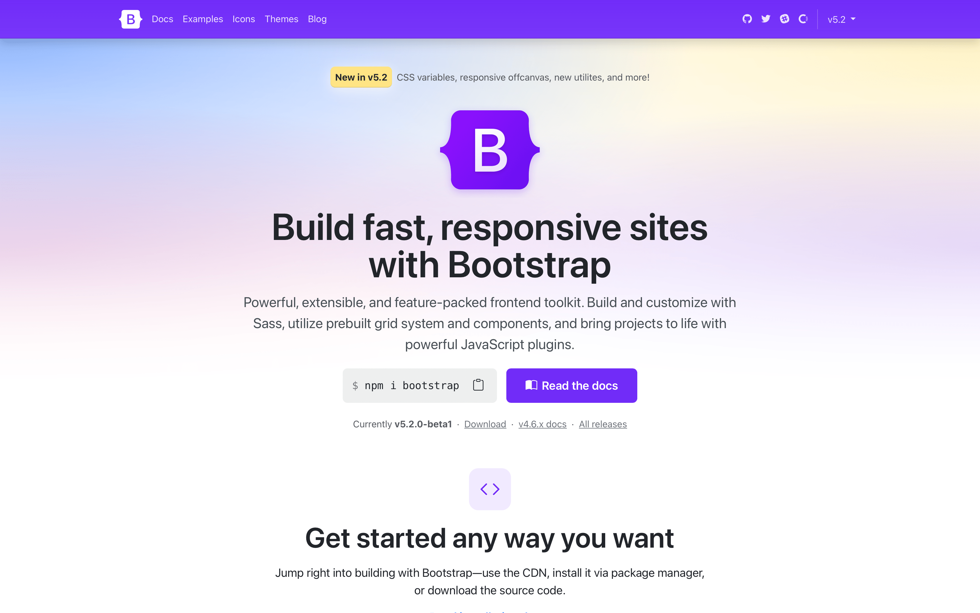
Another release, another docs refresh! From the get go, you’ll notice our Bootstrap Purple™ is much more vibrant now, making everything feel brand new. We’ve rewritten our entire homepage to better show off all the awesome features of Bootstrap.

New homepage

See the homepage in action and let us know what you think!

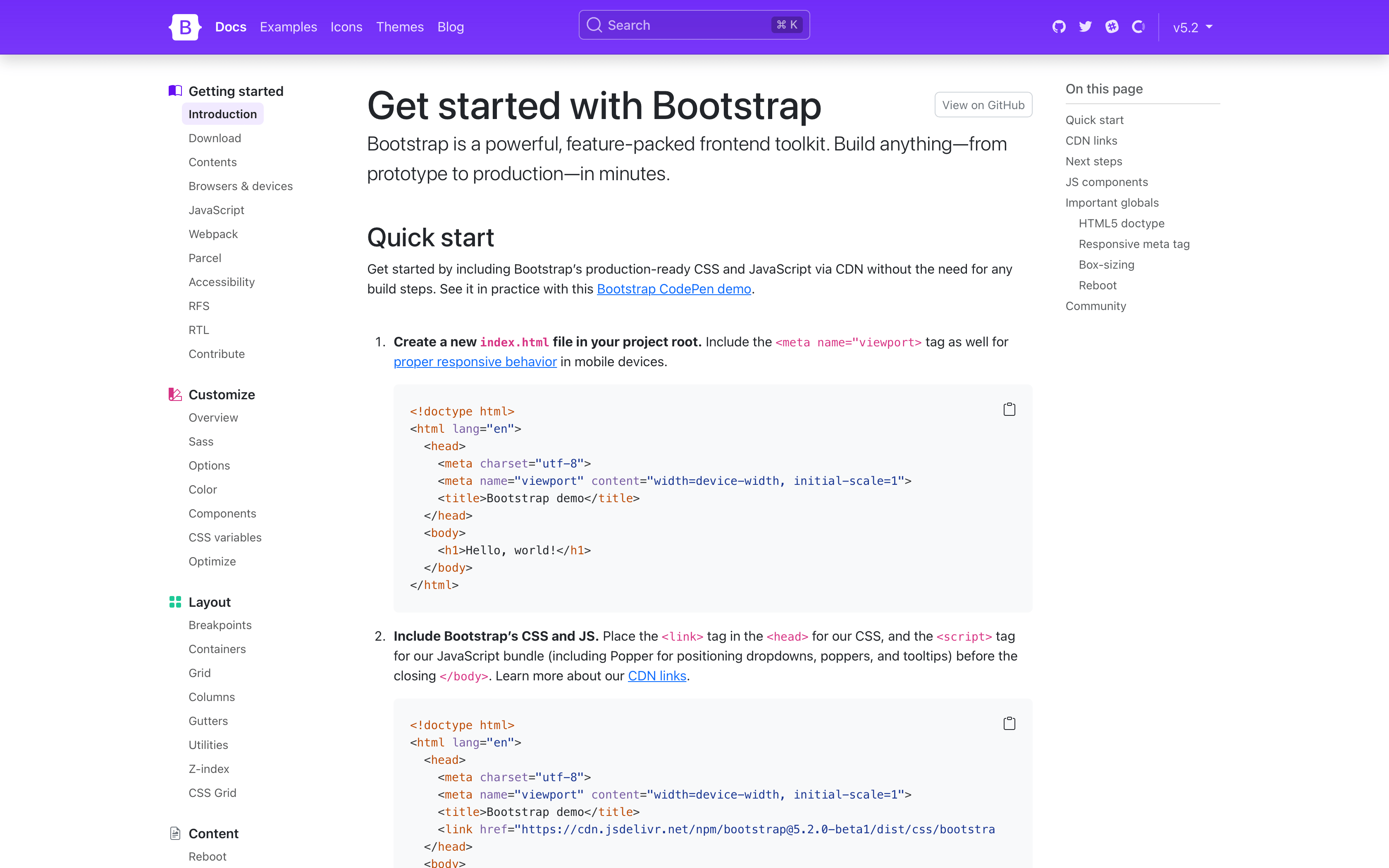
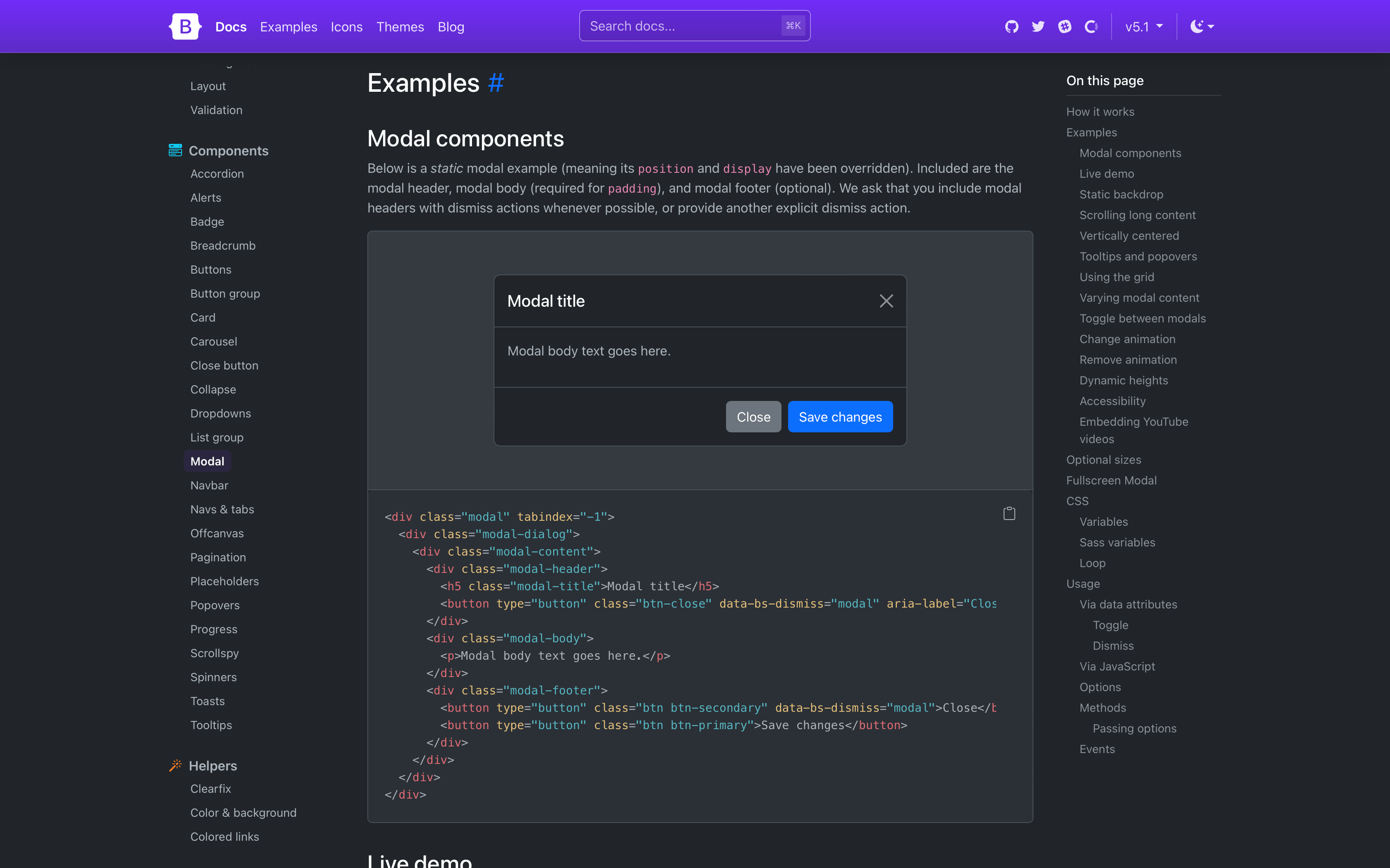
New docs page

Stepping into the actual docs, you’ll notice quite a few changes. We’ve streamlined our navbar, done away with our subnav, and changed the sidebar to always show every page link for greater discoverability. Show above is also our refreshed quick start guide, which is now a step-by-step instructional guide for using Bootstrap via CDN.

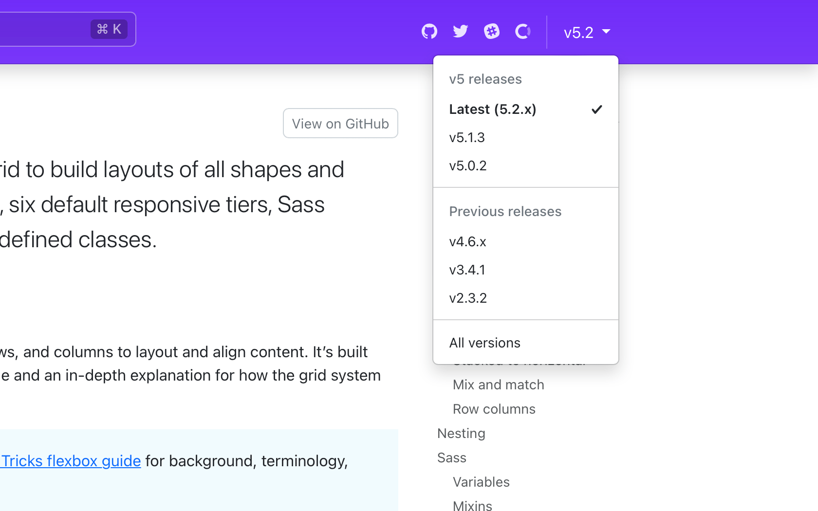
Docs version picker

The refreshed navbar also has a long-awaited new version picker for v5.2.0 and beyond. From any page, click the version and see options to navigate to previous minor releases of that same page. When a page doesn’t exist in an older release, you’ll see a disabled version in the dropdown. We currently have no plans to link pages across major versions.

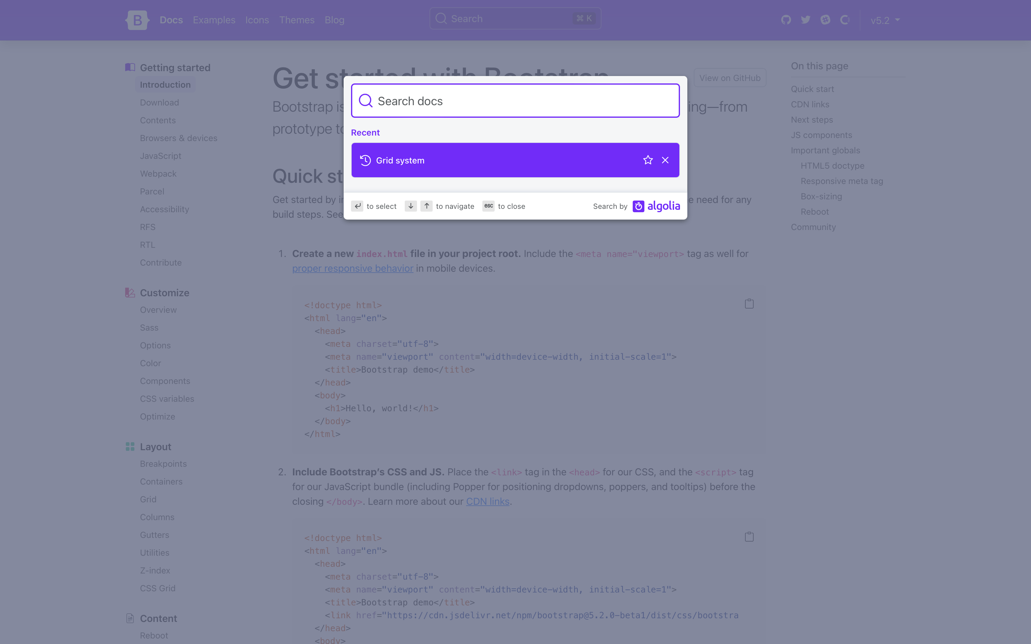
New search

The docs search is now powered by the latest version of Algolia’s DocSearch, bringing an improved design that even shows your most recent searches.

Design tweaks

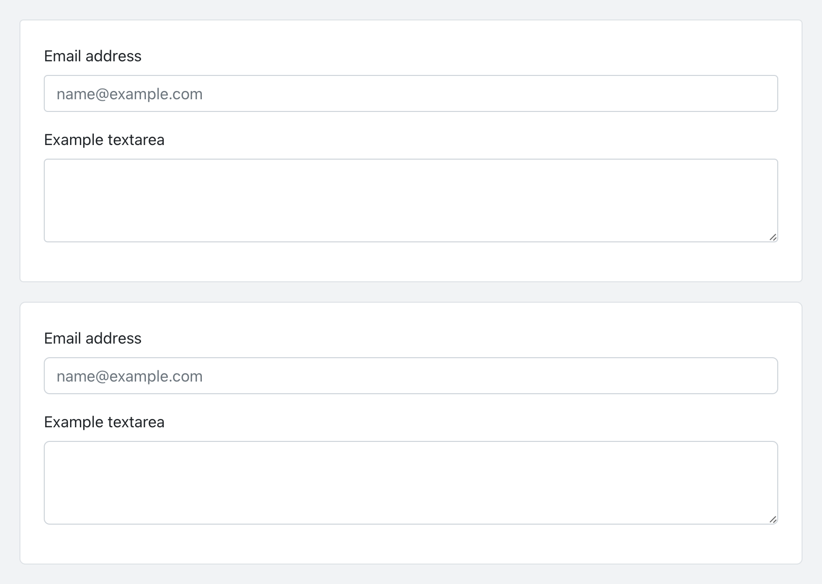
To coincide with our docs redesign, we’ve given our buttons and inputs a slight refresh with some refined border-radius values. It’s a small change, but a welcomed refresh to keep things modern and fresh. Here’s a look at the before and after of our buttons:

Updated buttons

And the before and after of our inputs:

Updated inputs

Component CSS variables

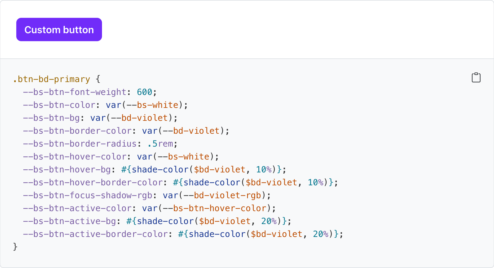
With this release, all our components now include CSS variables to enable real-time customization, easier theming, and (soon) color mode support starting with dark mode. Every component page has been updated to include a reference guide of the relevant CSS variables. Take for example our buttons:

--#{$prefix}btn-padding-x:#{$btn-padding-x};--#{$prefix}btn-padding-y:#{$btn-padding-y};--#{$prefix}btn-font-family:#{$btn-font-family};@include rfs($btn-font-size,--#{$prefix}btn-font-size);--#{$prefix}btn-font-weight:#{$btn-font-weight};--#{$prefix}btn-line-height:#{$btn-line-height};--#{$prefix}btn-color:#{$body-color};--#{$prefix}btn-bg:transparent;--#{$prefix}btn-border-width:#{$btn-border-width};--#{$prefix}btn-border-color:transparent;--#{$prefix}btn-border-radius:#{$btn-border-radius};--#{$prefix}btn-box-shadow:#{$btn-box-shadow};--#{$prefix}btn-disabled-opacity:#{$btn-disabled-opacity};--#{$prefix}btn-focus-box-shadow:000#{$btn-focus-width}rgba(var(--#{$prefix}btn-focus-shadow-rgb),.5);

Values for virtually every CSS variables are assigned via Sass variable, so customization via CSS and Sass are both well supported. Also included for several components are examples of customizing via CSS variables.

Custom button

Check out all our components to see how you can customize them to your liking.

New _maps.scss

Bootstrap v5.2.0-beta1 introduces a new Sass file with _maps.scss that pulls out several Sass maps from _variables.scss to fix an issue where updates to an original map were not applied to secondary maps that extend it. It’s not ideal, but it resolves a longstanding issue for folks when working with customized maps.

For example, updates to $theme-colors were not being applied to other maps that relied on $theme-colors (like the $utilities-colors and more), which created broken customization workflows. To summarize the problem, Sass has a limitation where once a default variable or map has been used, it cannot be updated. There’s a similar shortcoming with CSS variables when they’re used to compose other CSS variables.

This is also why variable customizations in Bootstrap have to come after @import "functions";, but before @import "variables"; and the rest of our import stack. The same applies to Sass maps—you must override the defaults before they get used. The following maps have been moved to the new _maps.scss:

  • $theme-colors-rgb
  • $utilities-colors
  • $utilities-text
  • $utilities-text-colors
  • $utilities-bg
  • $utilities-bg-colors
  • $negative-spacers
  • $gutters

Your custom Bootstrap CSS builds should now look like this with a separate maps import.

  // Functions come first
  @import "functions";
  // Optional variable overrides here
+ $custom-color: #df711b;
+ $custom-theme-colors: (
+   "custom": $custom-color
+ );
  // Variables come next
  @import "variables";
+ // Optional Sass map overrides here
+ $theme-colors: map-merge($theme-colors, $custom-theme-colors);
+
+ // Followed by our default maps
+ @import "maps";
+
  // Rest of our imports
  @import "mixins";
  @import "utilities";
  @import "root";
  @import "reboot";
  // etc

New helpers and utilities

We’re continuing to invest in our helpers and utilities to make it easier to quickly build and modify custom components.

  • Added new .text-bg-{color} helpers. Instead of setting individual .text-* and .bg-* utilities, you can now use the .text-bg-* helpers to set a background-color with contrasting foreground color.

  • Expanded font-weight utilities to include .fw-semibold for semibold fonts.

  • Expanded border-radius utilities to include two new sizes, .rounded-4 and .rounded-5, for more options.

Expect more improvements here as v5’s development continues.

Responsive offcanvas

Our Offcanvas component now has responsive variations. The original .offcanvas class remains unchanged—it hides content across all viewports. To make it responsive, change that .offcanvas class to any .offcanvas-{sm|md|lg|xl|xxl} class.

And tons more!

  • Introduced new $enable-container-classes option. — Now when opting into the experimental CSS Grid layout, .container-* classes will still be compiled, unless this option is set to false. Containers also now keep their gutter values.

  • Thicker table dividers are now opt-in. — We’ve removed the thicker and more difficult to override border between table groups and moved it to an optional class you can apply, .table-group-divider. See the table docs for an example.

  • Scrollspy has been rewritten to use the Intersection Observer API, which means you no longer need relative parent wrappers, deprecates offset config, and more. Look for your Scrollspy implementations to be more accurate and consistent in their nav highlighting.

  • Added .form-check-reverse modifier to flip the order of labels and associated checkboxes/radios.

  • Added striped columns support to tables via the new .table-striped-columns class.

For a complete list of changes, see the project on GitHub.

Coming soon: Dark mode!

Much of the work we’ve done in v5.2.0-beta1 has been in support of adding dark mode to Bootstrap. Yes, it’s finally coming in our next minor release!

Dark mode

We’re adding tons of new global CSS variables, cleaning up docs styles, and better supporting overall customization. Some details and topics being worked on for dark mode:

  • Do we provide a JS plugin for toggling color modes? Right now we’re just building custom functionality for our docs.

  • Our current implementation is being built with data-theme selectors which allows explicit color mode switching (via user control vs and system preference) and custom color modes beyond light and dark.

  • We’re adding quite a few new colors outside $theme-colors to improve subtle UI customization. These are being implemented via :root and [data-theme="{theme}"] selectors for global use.

We’d love your feedback along the way, so check out the dark mode pull request and dark mode staging site to test it out.

Also coming in v5.3.0

There’s lots to look forward to in our next minor release, though we’ll likely have some bug fixes along the way.

And likely a lot more!

Get the release

Head to https://getbootstrap.com for the latest. It’s also been pushed to npm:

npm i bootstrap@v5.2.0-beta1

Read the GitHub v5.2.0-beta1 changelog for a complete list of changes in this release.

Support the team

Visit our Open Collective page or our team members’ GitHub profiles to help support the maintainers contributing to Bootstrap.

Bootstrap Icons v1.8.2

$
0
0

Bootstrap Icons v1.8.2 has arrvied with some bug fixes and a refreshed docs design to match our main project.

Here’s a quick rundown on the icon fixes:

  • Fix cutoff bank icon
  • Fix house-heart and house-heart-fill fill-rules
  • Fix corners of pentagon icons to match other shapes
  • Fix fill-rule for x-lg
  • Fix cutoff tool icon

On the CSS side, we’ve also added font-display: block to help address our icon font affecting Google Lighthouse scores.

Looking for more new icons? Head to the issue tracker to check for open requests or submit a new one.

Install

To get started, install or update via npm:

npm i bootstrap-icons

Or Composer:

composer require twbs/bootstrap-icons

You can also download the release from GitHub, or download just the SVGs and fonts (without the rest of the repository files).

Figma

The Figma file is now published to the Figma Community! It’s the same Bootstrap Icons Figma file you’ve seen from previous releases, just a little more accessible to those using the app.

Using CSS variables in Bootstrap

$
0
0

Bootstrap v5.2.0-beta1 added a slew of CSS custom properties, or CSS variables, across the :root level and all our core components. Here’s a quick look at how you can utilize them in your projects.

With CSS variables, you can now customize Bootstrap easier than ever, and without the need for a CSS preprocessor. All the power of Sass is still there behind the scenes, but CSS variables adds a ton of power for the future. Use and compose new values, updates styles globally without recompiling, set fallback values, setup new color modes, and more.

Let’s dig in.

CSS variables?

Their official name is custom properties, but they’re often referred to as CSS variables thanks to their most immediate use case for setting specific values. Consider reading the MDN CSS custom properties article or the CSS Tricks guide if you need a primer.

In a nutshell, CSS variables allow you to name frequently used values. For example, instead of writing #6f42c1 everywhere, you can set --purple: #6f42c1. Then you can use that variable later on with the var() function.

:root{--purple:#6f42c1;}.custom-element{color:var(--purple);}

We use CSS variables in Bootstrap to set many property values globally, across our components, and in some of our utilities.

Groups of variables

When we talk about CSS variables in Bootstrap, we’re referring to three major groups:

  • Root variables — Globally scoped variables available on the :root element (<html> usually) and accessible by any element throughout the DOM.

  • Component variables — Variables scoped specifically to each component, usually on the component’s base class, and their modifier classes and Sass mixins.

  • Utility variables — Used as modifiers within other utility classes.

Regardless of where they are, all of our CSS variables are prefixed with --bs-, so you know where they’re coming from and how they might be used across codebases that mix Bootstrap’s CSS with additional custom styles. You’ll also notice that we don’t put all our component variables at the root level. This keeps CSS variables scoped to their intended use cases and prevents polluted variables in the global :root scope.

It’s also worth mentioning two larger efforts that are still to come around CSS variables:

  1. Adding CSS variables to all our forms
  2. Adding more nuanced global theme variables and support for color modes like dark mode.

These are likely coming in v5.3.0 (our next minor release after v5.2.0 stablizes), so in the mean time, check out the GitHub repo to see how things are shaping up.

Root variables

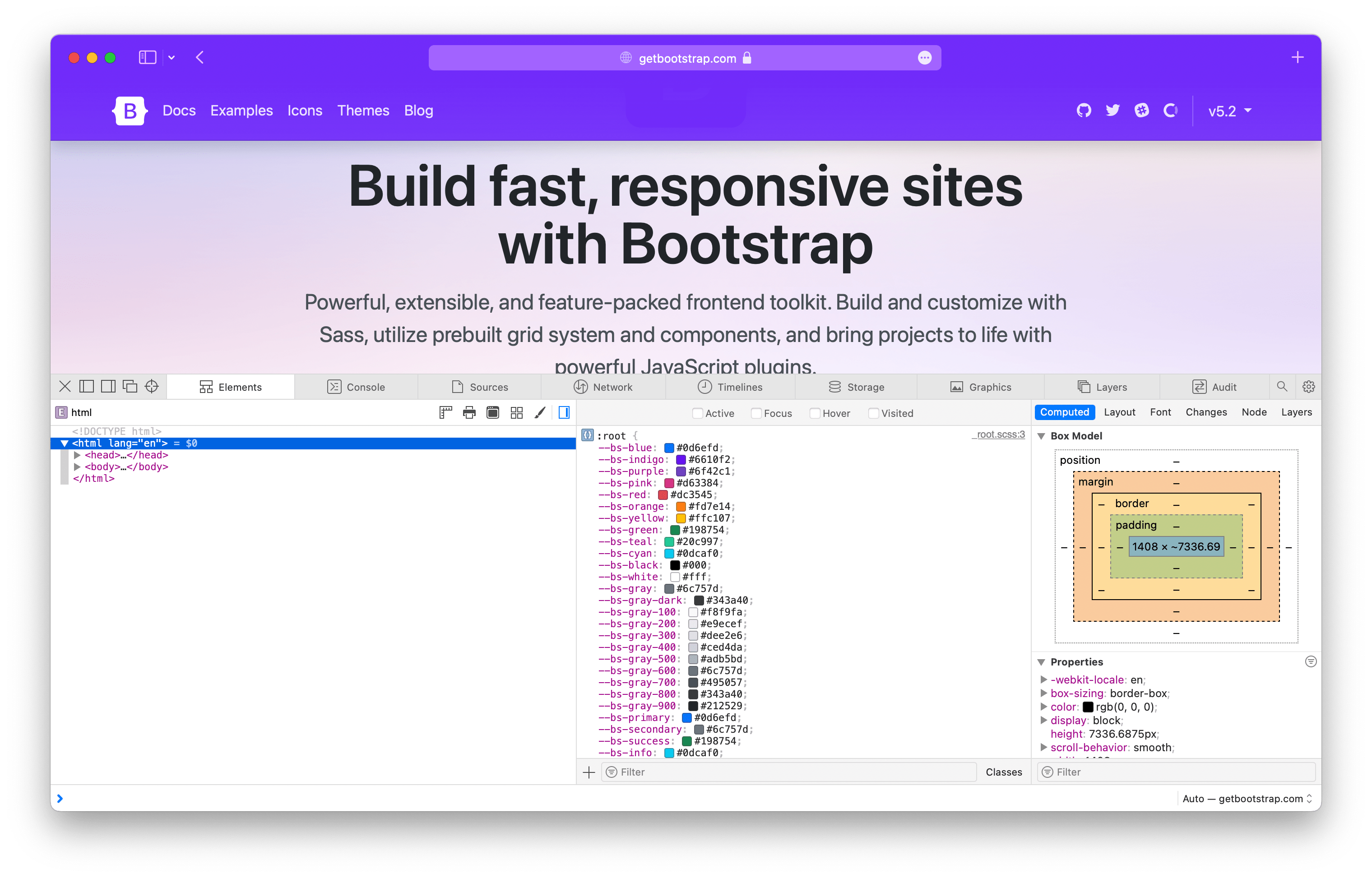
Root variables in web inspector

Bootstrap has a ton of root variables and we’ll only be adding more in future updates for the aforementioned color mode support. As of this post, we have the following CSS variables on the :root element:

  • Colors — All named colors, gray colors, and theme colors. This also includes all our $theme-colors in their rgb format.

  • Body font styles — Everything from font-size to color and more, all applied to our <body> element.

  • Shared properties — For property-value pairings that we consider theme specific, like link colors and border styles.

Root CSS variables are used extensively across other parts of Bootstrap to allow you to easily override our default styles at a global level. For example, if you wanted to adjust the default border-radius and link color for our components, you could override a couple variables instead of writing new selectors.

// custom.css
:root{--bs-border-radius:.5rem;--bs-link-color:#333;}

You can even use other root variables to override those values:

// custom.css
:root{--bs-border-radius:var(--bs-border-radius-lg);--bs-link-color:var(--bs-gray-800);}

Without CSS variables, you’d have to use a preprocessor like Sass or write new selectors for every instance of these properties across all components. The former is relatively easy, the latter not so much. CSS variables help solve that.

Component variables

On our components, CSS variables get even more power for customizing. Nearly everything under the Components section in our docs sidebar now has CSS variables available to you:

Scrollspy and close button have no relevant CSS variables, so they’re excluded here.

Throughout our documentation you’ll find examples of customizing our default components by overriding their CSS variables. One great example comes from our own docs where we write our own button styles to create a purple button.

.btn-bd-primary{--bs-btn-font-weight:600;--bs-btn-color:var(--bs-white);--bs-btn-bg:var(--bd-violet);--bs-btn-border-color:var(--bd-violet);--bs-btn-border-radius:.5rem;--bs-btn-hover-color:var(--bs-white);--bs-btn-hover-bg:#{shade-color($bd-violet,10%)};--bs-btn-hover-border-color:#{shade-color($bd-violet,10%)};--bs-btn-focus-shadow-rgb:var(--bd-violet-rgb);--bs-btn-active-color:var(--bs-btn-hover-color);--bs-btn-active-bg:#{shade-color($bd-violet,20%)};--bs-btn-active-border-color:#{shade-color($bd-violet,20%)};}

Which looks like this:

Custom Bootstrap docs button

Another great example is from our tooltips. You can add custom classes to tooltips and popovers in Bootstrap with data-bs-custom-class="custom-tooltip". Then, with one CSS variable, you can change the tooltip background and arrow color.

.custom-tooltip{--bs-tooltip-bg:var(--bs-primary);}

Which looks like this:

Custom tooltip

There are dozens of CSS variables in play across our components. All of them are referenced in a new section on the relevant docs page. For example, here are our modal CSS variables. This is in addition to all the Sass variables, mixins, loops, and maps used for each component.

Utility variables

Not every utility class uses CSS variables, but the ones that do gain a good amount of power and customization. Background, border, and color utilities all have what we call “local CSS variables” to improve their usefulness. Each of them uses CSS variables to customize the alpha transparency value of rgba() colors.

Consider our background color utilities, .bg-*. By default each utility class has a local variable, --bs-bg-opacity with a default value of 1. To change the background utility alpha value, you can override that value with your own styles, or some new .bg-opacity-* utilities.

<divclass="p-3 bg-success bg-opacity-25">  ...
</div>

Here’s how .bg-success looks with all our .bg-opacity-* classes applied:

Background opacity examples

And the same is available for border color opacity (--bs-border-opacity and .border-opacity-*) and text color opacity (--bs-text-opacity and .text-opacity-*). So many color options are now available with these utilities.

By default, we ship with five values for these various opacity utilities.

Class namesAlpha value
.text-opacity-10
.bg-opacity-10
.border-opacity-10
.1
.text-opacity-25
.bg-opacity-25
.border-opacity-25
.25
.text-opacity-50
.bg-opacity-50
.border-opacity-50
.5
.text-opacity-75
.bg-opacity-75
.border-opacity-75
.75
.text-opacity-100
.bg-opacity-100
.border-opacity-100
1

Expect more CSS variables to make their way into our utilities. There’s a lot of power in real-time customization, even for what we consider immutable styles.


Ready to get started with Bootstrap? Checkout the quick start guide so you can put these new CSS variables to work in your next project!

Bootstrap Icons v1.9.0

$
0
0

Bootstrap Icons v1.9.0 is here with over 140 new and updated icons, including some longstanding requests for new brands, transportation options, numbers and letters, and so much more. With this release, we’re now at over 1,800 icons!

140+ new icons

Here’s a quick look at all the new icons in v1.9.0:

New love icons in v1.9.0

  • Tons of new brand icons including popular browsers, Ubuntu, Google Play, Android, Dropbox, and many more.
  • New transportation icons including cars, trains, planes, fuel, and common road signs.
  • New number and letter icons for 1-9, R, C, CC, H, and P (for use cases like registered trademark, copyright, Creative Commons, hospital or helicopter, and parking).
  • New medical icons for prescriptions, pills, and viruses.
  • New keyboard icons for tab and escape.
  • New Universal Access cions.
  • Redrawn cup icon, now with a steam variant for hot beverages.
  • Fire, finally!

There are a handful more in there as well, so have a look and put them to use in your next update! In addition, we’ve updated our docs to include mention of Composer installs.

Looking for more new icons? Head to the issue tracker to check for open requests or submit a new one.

Install

To get started, install or update via npm:

npm i bootstrap-icons

Or Composer:

composer require twbs/bootstrap-icons

You can also download the release from GitHub, or download just the SVGs and fonts (without the rest of the repository files).

Figma

The Figma file is now published to the Figma Community! It’s the same Bootstrap Icons Figma file you’ve seen from previous releases, just a little more accessible to those using the app.

Viewing all 134 articles
Browse latest View live